Modern geometric sans-serif for branding and documents
Designosaur, from Designosaur, is a modern sans-serif typeface intended to deliver clear, geometric letterforms for both screen and print. It supplies a single TrueType font file with balanced kerning, standard Latin characters, and proportions optimized for headings and short blocks, making consistent typography easier across applications. Key qualities include geometric proportions, high legibility at multiple sizes, and professional spacing that reduces manual adjustment for logos, body text, and interface copy. Graphic designers, students, and hobbyists get a neutral workhorse typeface suitable for personal creative projects.
What does the typeface change about text legibility?
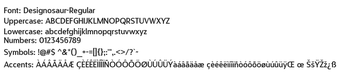
The typeface applies a geometric, minimalist sans-serif structure that prioritizes legibility across sizes. It is described as suitable for display headings and short blocks of text, with proportions tuned to reduce visual noise. The package is delivered as a TrueType Font (TTF) file, so designers can install a single file to access the face in desktop software.
How much control does the typeface give over spacing and kerning?
The font ships with balanced kerning and measured spacing, reducing the need for manual letter-pair fixes in typical layouts. The supplied character set covers uppercase, lowercase, numerals, and basic punctuation, so typographic control is predictable but focused on standard Latin usage. Teams that need advanced OpenType features or extended glyph coverage should verify availability before adopting it for broad international work.
Is the typeface simple to install and available in common apps?
Installation follows a conventional workflow: extract the .ttf from the download and use the system install command to add the font. Once installed, the face appears in document and image editors' font menus, including word processors and graphics applications. The typeface is compatible with desktop platforms that support standard TrueType or OpenType files, which keeps deployment straightforward for most users.
Who benefits most, and where does the font not fit?
Designers, students, and hobbyists find the face useful for branding mockups, interface copy, and short editorial text that needs neutral letterforms. For projects requiring broad script coverage or many specialty glyphs, the font's scope is limited to the standard Latin alphabet and basic punctuation. The developer distributes the file through major font repositories, which aids discovery and community use.
Practical choice for single-script design, with clear limits
Designosaur is a practical option for creatives who need a neutral, legible sans-serif for branding, headings, and short-form copy. Its glyph scope focuses on the standard Latin alphabet, so projects that require wide Unicode coverage or many specialty symbols should seek a different face. Use this typeface as a dependable baseline for single-script mockups and short editorial layouts.
Pros
High legibility across multiple font sizes
Balanced kerning and spacing reduces manual adjustments
Distributed as a TrueType (TTF) file for simple installation
Geometric proportions suitable for logos and display headings
Cons
Glyph set limited to basic Latin characters and punctuation
Advanced OpenType features or extended glyphs not specified
Not intended for wide Unicode or symbol-heavy projects
Laws concerning the use of this software vary from country to country. We do not encourage or condone the use of this program if it is in violation of these laws. Softonic may receive a referral fee if you click or buy any of the products featured here.